Ana and César had found a very cheap apartment in the center of Palma, but being not knowledgeable about the subject they asked me for an opinion about the possibilities I had and if it was worth buying.
When we visited it we saw that it had an absolutely chaotic design, but as Elsie de Wolfe (the first interior designer woman) said there is no such a bad house that it cannot become something worthwhile, so we got to work to manage to make it a comfortable and functional home.
The challenge was immense because the distribution was not very logical: a tiny kitchen attached to the only bathroom in the house that was entered through the master bedroom. The rest of the rooms were poorly designed.
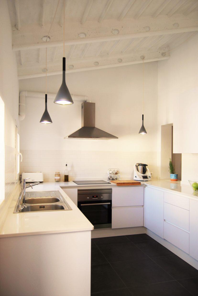
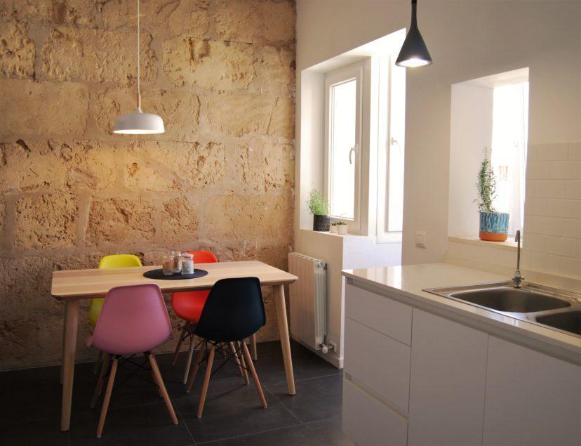
Our proposal was to invest the existing spaces, placing the kitchen, dining room and living room in the quietest area and take advantage of the existing high ceilings to gain a feeling of spaciousness and lots of light. In this way we get a very functional distribution of housing.
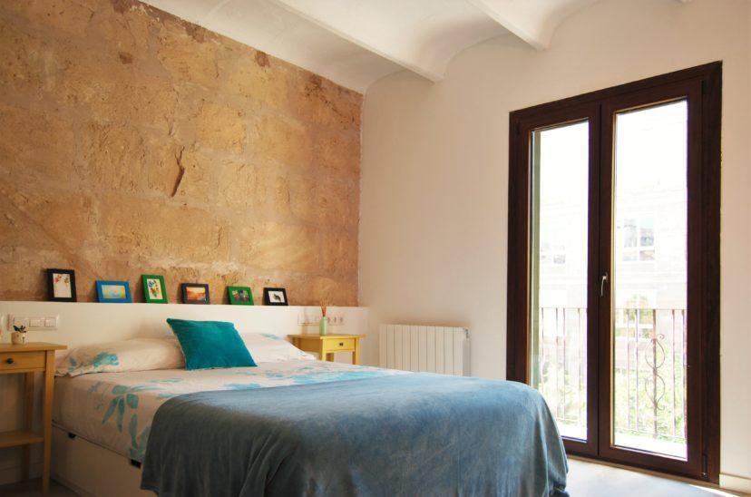
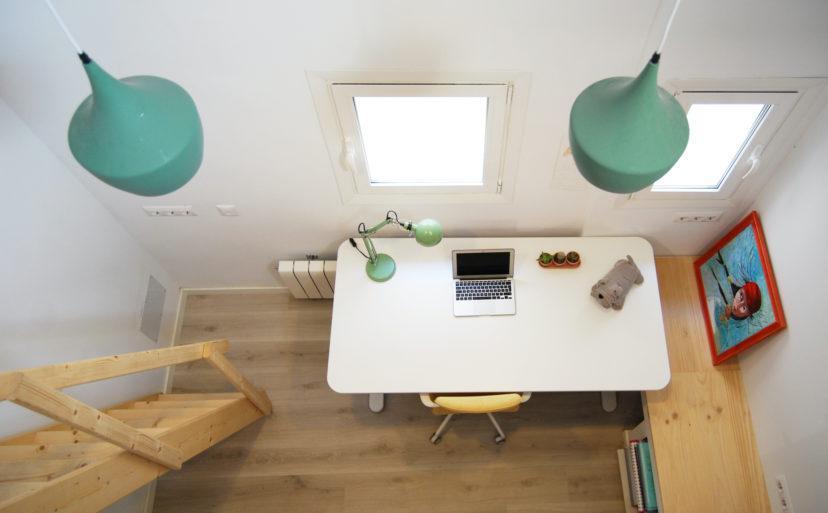
The design touch was to recover the existing hidden materials, Mallorcan marés walls, sloping ceilings of exposed concrete beams, giving it an industrial touch without forgetting the warmth that a home should have, so the materials we used were wood for the floor and furniture in light tones in order to generate a harmonious ensemble.
- Palma


